Text is arguably one of the most important if not the most important element in an image. whether you’re creating a social media post, poster, or advertisement, the way you present your text can have a big impact on your audience.
Fortunately for us, there is an amazing graphic design platform out there called Canva that can help us with making text stand out.
Canva offers various tools and features that can easily transform that boring piece of text you used before into a masterpiece in minutes.
In this article, I will walk you through all 5 methods that I use in Canva to make my text stand out. So let’s cut the talking and jump right into this.
Method 1: Using a font that matches the theme of my image
I think this is one of the most overseeing topics in terms of ”making your text stand out”. I mean yes you can spend a lot of time fine-tuning the font you are using and it will probably look better than before.
But at the end of the day, it’s all about what font you are using and does it matches the theme of the image.
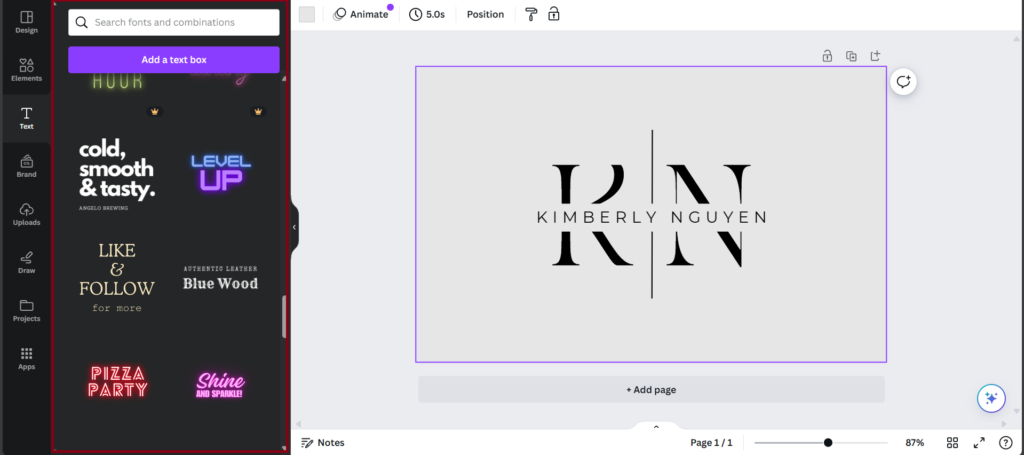
Take a look at the image below as an example. You can see the text on the left side of the image is more of a cooking/invitation style. While the text on the right side of the image is more of a straight-to-the-point/futuristic style.
Which is good because the theme of this image is AI.

Fortunately for you choosing a font that suits well with the theme of your image can be done very easily in Canva. Because they offer countless free-to-use and (Canva Pro) fonts.
So now you know that you should always pick a font that matches the theme of your image but let’s dive even deeper into this and what I mean by that is ”fine-tuning text”.
Method 2: Using a shadow effect
Adding a shadow effect to your text can make it look so much more realistic and visually appealing. It just looks like it’s really there and that’s what makes this effect so special.
What’s also so nice about this effect is that you can control the direction, offset, blur, and transparency of the shadow.
And that’s exactly the reason why I added this effect to this list because that just tips it off. Take a good at this picture here below to see the before and after.

Method 3: Using different colors on my words or letters
First of all, I’m not talking about giving each letter in the text a different color till you have a rainbow text. No definitely not that. Well in some scenarios it could look but let me just get to the point.
Applying a new color to a letter or word in your text can have a positive effect if you do it right. Yes, you read that right I said ”if you do it right” Wow that rimed wait what again.
Alright, but jokes aside you can’t just throw a random color to a letter or a word in your text. It will have to make sense.
What I mean by that is let’s say you’re picture is green-themed. The text you’re using is then probably white or green or something close to that.
If you were to add yellow or red to that text that would just look weird unless those 2 colors can be found in the image.

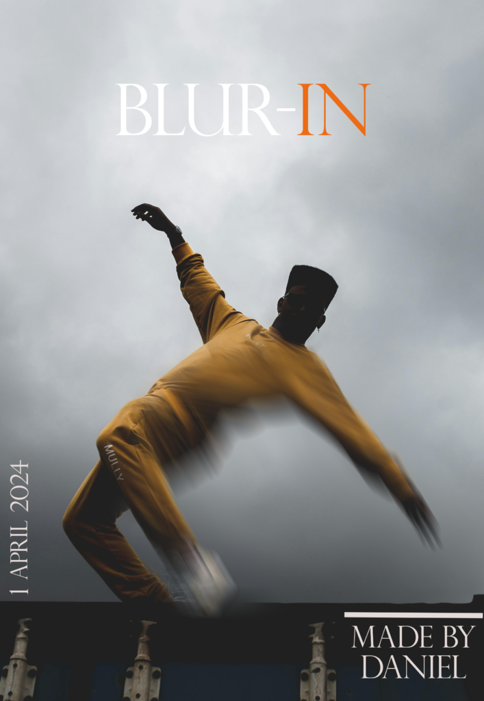
As you can see the red just doesn’t match with theme of this image. But in the image here below I added an orange/brown color to the word ”in” because the boy had a brown tracksuit on.
Method 4: Using curved text
Curving text is a smart move if your main goal is to draw a lot of attention to that specific picture. A lot of people use this technique if they want to advertise something like an event.
The reason why people do that is that we people are curious beings.
Let’s say you’re walking down the street and you see a poster with curved text on it. The chances are high you would want to know what it says.
And the best thing about it is that Canva can curve text in just a few clicks. See this image below to see what I mean.

Method 5: Using an effect
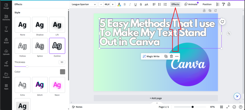
In Canva there’s a panel where you can find special effects for your text. Earlier in this blog post In Method 2 and 4, I talked about curving text and adding shadow to your text.
Both of those two effects can be found in the effects panel. But there are also 8 other effects that you can use at the moment apart from the curve and shadow effect.
For the sake of this blog post, I will not talk about all of them but if you want to know more about them I suggest trying them out in Canva and see which ones you like the most.
Final Thoughts
I hope you enjoyed this blog post and might even learned something new that you didn’t know before. If you want me to write a new post about all the deepest insights of all 5 methods or have any questions feel free to contact me and I will answer you as soon as possible.


